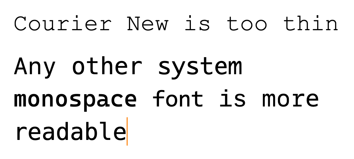
The related PR: fix: put all kinds of system monospace fonts before Courier New
There are multiple issues about Courier New being awful-looking on Linux:
Courier New is only readable under Windows because ClearType made a special case for it.
Therefore, it should never be one’s first choice for monospace font. It should be put at the end of the list.
By the way, though Courier New is a proprietary font, it is available on Linux through Microsoft’s Core Fonts for the Web. That’s why Linux users might see it.
In this PR I propose we set the monospace font stack to:
ui-monospace, 'SF Mono', 'SFMono-Regular', Menlo, Monaco, 'Cascadia Mono', Consolas, 'Liberation Mono', 'Noto Sans Mono', 'DejaVu Sans Mono', 'Roboto Mono', 'Courier New', monospace;This puts all kinds of system monospace fonts before Courier New, with some personal preference.
ui-monospaceis part of the CSS Fonts Module Level 4, and only available in Safari for now. The difference between it andmonospaceis thatui-monospaceaims to match the user’s system monospace font, whilemonospaceis a generic monospace font that’s defined by the browser. So it’s better to put it first. It currently defaults to “SF Mono” on macOS.- SF Mono is for macOS users who don’t use Safari.
SFMono-Regularis a hack before Apple made “SF Mono” available everywhere (It was only bundled with Xcode and Terminal on first launch).- Menlo was the macOS default monospace font from 2009 to 2015.
- Monaco was the macOS default monospace font before Menlo.
- Cascadia Mono is the default monospace font for Windows Terminal. It’s widely regarded as a modern replacement for Consolas. Its variant, “Cascadia Code”, features programming ligatures. Programming ligatures is a controversial topic, and isn’t average-user-friendly when used in the documentation, so I chose Cascadia Mono here.
- Consolas is the default monospace font in Visual Studio and VS Code. It has been the modern monospace font of choice in Windows since Windows Vista.
- Liberation Mono is the default monospace font in Red Hat Enterprise Linux. It’s a metric-compatible replacement for Courier New.
- Noto Sans Mono is the default monospace font in ChromeOS and Fedora 36+.
- DejaVu Sans Mono is a popular choice among Linux distributions. It was the default monospace font in Fedora before v36 and ChromeOS Secure Shell before v73. It’s also an inspiration for Menlo.
- Roboto Mono is the default monospace font for Android.
- Courier New is the web-safe fallback.
I intentionally left out a few system monospace fonts:
- Ubuntu Mono. According to the user feedback in the StackOverflow design refresh announcement, Even Ubuntu users don’t like it. It’s smaller than its sans-serif counterpart, too, which is a notable issue.
- Source Code Pro. It’s the default monospace font in GNOME. It’s a good UI font, but I doubt it’s a good choice for code. It’s too wide.
As a reference:
GitHub’s default:
ui-monospace, SFMono-Regular, SF Mono, Menlo, Consolas, Liberation Mono, monospaceTailwind 3.4.13:
ui-monospace, SFMono-Regular, Menlo, Monaco, Consolas, "Liberation Mono", "Courier New", monospace;StackExchange’s design refresh in 2021: We are switching to system fonts on May 10, 2021 - Meta Stack Exchange